





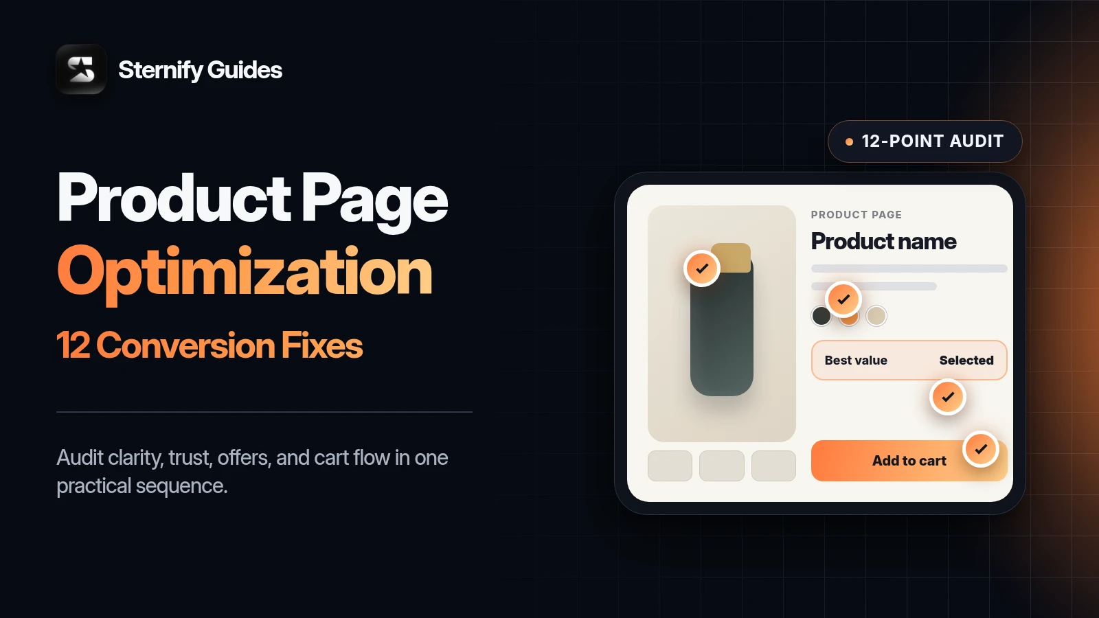
Shopify product page optimization is the process of improving the page so more visitors understand the product, trust the offer, and add the right variant to cart. It covers product media, copy, the buy box, reviews, shipping information, mobile performance, and the handoff into the cart.
Use this 12-point checklist before you buy more traffic. Product-page work is one of the clearest starting points for Shopify conversion rate optimization because it addresses the decision immediately before Add to Cart. More visitors will not repair a confusing offer.
Key takeaways
- Fix clarity before adding tactics: the product, customer, outcome, price, and variants should be obvious quickly.
- Use media, reviews, shipping, and returns to answer the objections closest to Add to Cart.
- Add bundles, upsells, gifts, or urgency only after the base offer is clear and trustworthy.
- Test the complete path on a real phone, from the first product view through cart and checkout.
The checklist below follows the order in which a customer makes the decision. Start at number one. Do not jump straight to bundles, upsells, or urgency when the basic product story is still unclear.
How to use this Shopify product page optimization checklist
Open your highest-traffic product page on a phone. Review it as if you have never heard of the brand. Complete the four phases in sequence, then repeat the audit on your next two best-selling products.
- Clarity: Can a new visitor understand the product and choose the right variant?
- Trust: Does the page answer the objections that could stop the purchase?
- Offer: Is there a useful reason to buy now or buy more?
- Cart: Does the buying experience stay clear after Add to Cart?
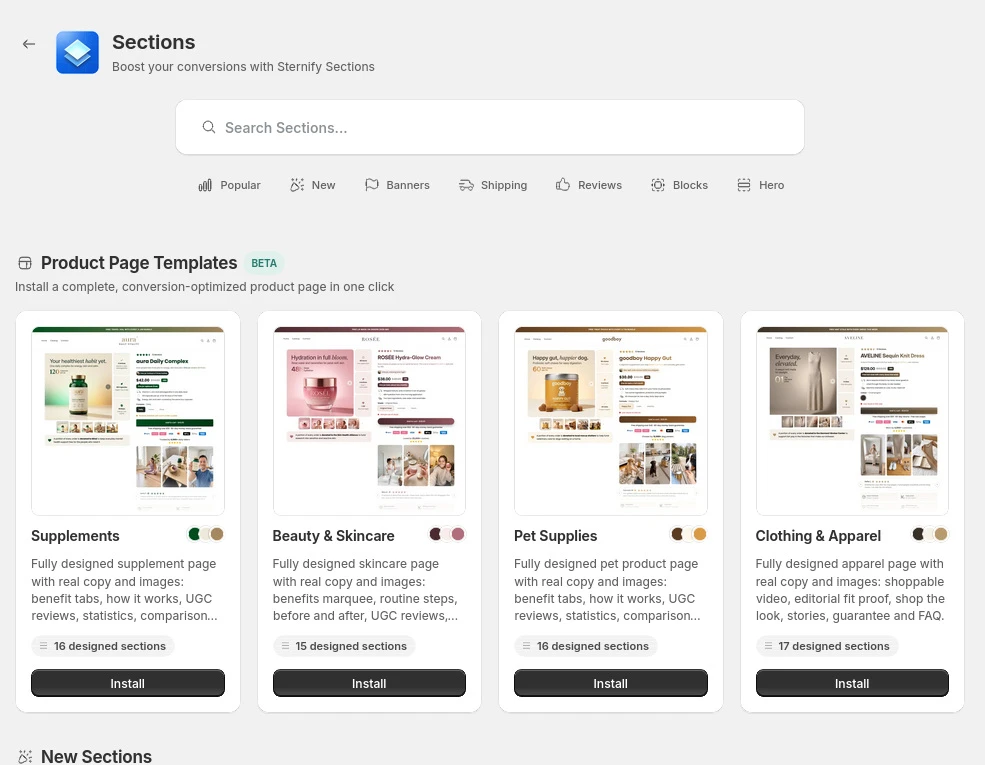
1. Make the product understandable within five seconds
A shopper should know what the product is, who it is for, and why it is useful before they scroll. Product names such as “The Essential” or “Model 04” may fit a brand system, but they often need a descriptive subtitle to do the selling work.
Put the product type and main outcome near the title. Replace vague adjectives with details a customer can verify. “Premium hydration bottle” says little. “Insulated 750 ml bottle that stays cold through a workday” gives the shopper something concrete.
The title names the product clearly
The first sentence states the main outcome
The price and available variants are visible without hunting
The page avoids competing headlines above the Add to Cart button
2. Use product media to answer physical questions
Product photos should reduce uncertainty, not fill a carousel. Show the product from useful angles, in use, and next to something familiar so customers can judge scale. Apparel, accessories, cosmetics, furniture, and handheld products benefit from human or in-context images because written dimensions alone are hard to picture.
Baymard’s product-page research found that 42% of test participants tried to determine product size from images. Include at least one scale image for products whose size, fit, or proportion affects the decision.
3. Make variants and availability obvious
A customer should not need to open a dropdown to discover that their size is unavailable. Show important options as visible buttons or swatches, mark unavailable choices clearly, and update the image, price, and stock state when the selection changes.
Test every combination on mobile. Confirm that the selected state is unmistakable and that Add to Cart cannot submit the wrong or unavailable variant. If the product needs a size guide, place the link next to the size selector rather than burying it in the footer.
4. Optimize the buy box around one clear Add to Cart action
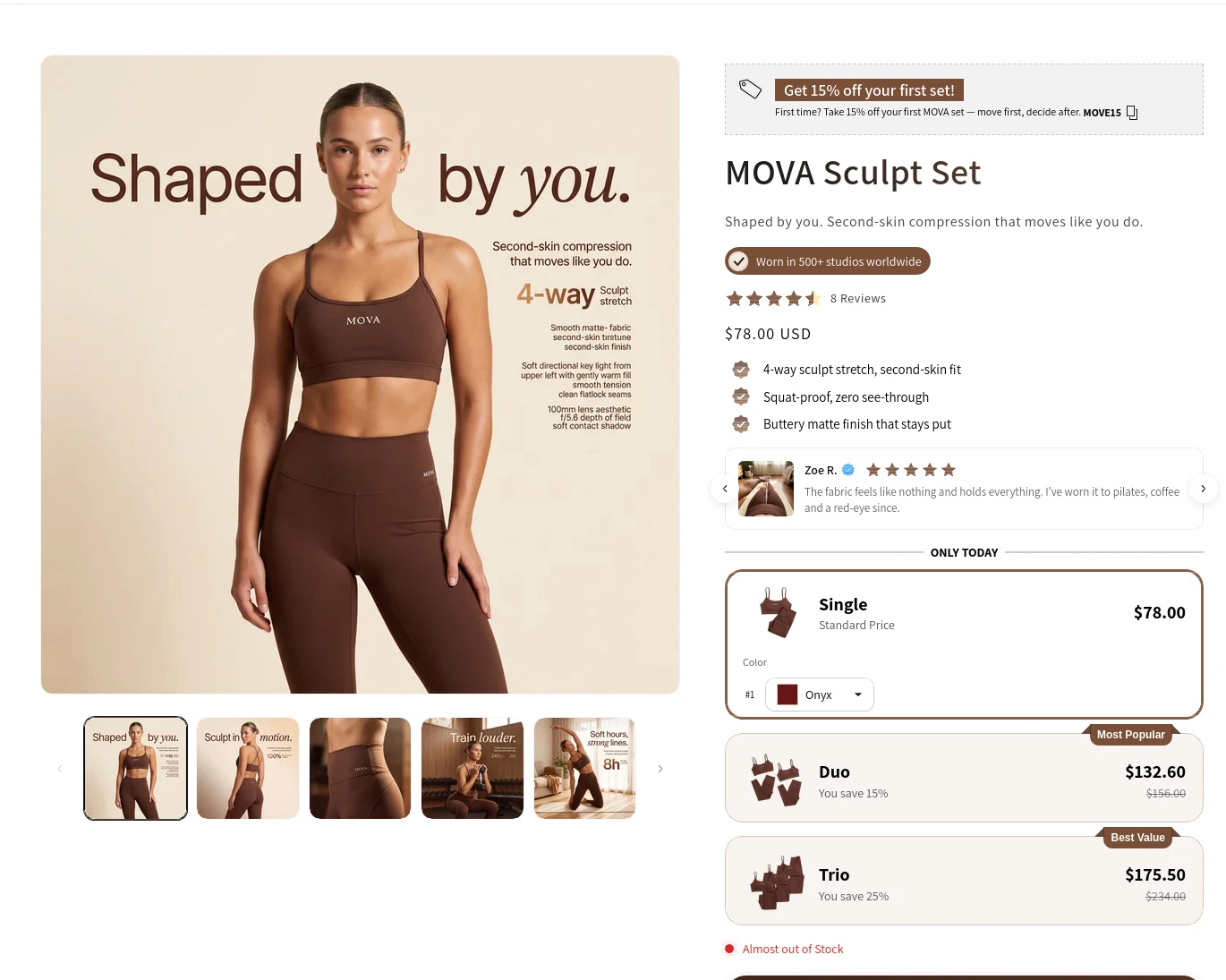
The buy box is the area around the title, price, variants, quantity, and Add to Cart button. Its job is to move the shopper from interest to a confident selection. Every extra badge, timer, payment message, app block, and promotional sentence competes for attention.
Keep one primary call to action. Make the Add to Cart button visually dominant and easy to tap, keep the selected price close to it, and place supporting reassurance below the action. Secondary options such as accelerated checkout should not make the main path harder to understand.
5. Put shipping, returns, and payment reassurance near the decision
Shoppers calculate risk before they add an unfamiliar product to the cart. Answer the questions that affect total cost and reversibility: when will it arrive, what will shipping cost, can it be returned, and which payment methods are accepted?
Baymard recommends displaying or linking to the return policy from the main product-page content and providing a total-order-cost estimate near the buy section. You do not need to paste the full policy beside the button. A short, accurate summary with a clear link is enough.
Delivery estimate or shipping calculation
Short return-policy summary
Payment options that matter to your market
No unsupported trust badges or security claims
6. Use reviews as evidence, not decoration
A star average helps, but buyers learn more from specific reviews. Prioritize reviews that mention fit, product quality, delivery, setup, durability, and customer support. Let shoppers filter or scan for the concerns that match their situation.
Keep the rating summary near the product title and the full review experience lower on the page. Include customer photos or videos when available. Respond to credible negative reviews instead of hiding every objection. A useful response shows future shoppers how the company handles problems.
7. Turn the lower page into an objection-handling sequence
Once the shopper understands the buy box, the rest of the page should deepen confidence. Organize the content around customer questions rather than your internal feature list.
What problem does this solve?
How does it work or how do I use it?
What is included?
How does it compare with the obvious alternative?
What do customers worry about before buying?
Use benefit sections, demonstrations, comparison blocks, specifications, and FAQs only where they answer one of those questions. Delete repeated claims. Repetition without new proof makes the page longer, not stronger.
8. Add a bundle only when products belong together
Bundles can raise average order value when they simplify a real buying decision. Good examples include a starter kit, a routine, a refill set, or products customers already purchase together. A random group of slow-moving products with a discount is inventory clearance, not a compelling bundle.
Show the individual items, the combined value, the bundle price, and the exact saving. Keep variant selection manageable. If the customer must make several choices, show progress and preserve each selection.
Strong bundle signals
- Products solve one connected problem
- Bundle value and saving are easy to verify
- Variants remain simple to choose
- The set reduces shopping effort
- The offer is tested on a high-traffic product
Weak bundle signals
- Unrelated products grouped for convenience
- Discount hides weak product selection
- Too many variant decisions
- Savings are unclear or exaggerated
- Bundle competes with the main purchase path
9. Keep product-page upsells relevant and low friction
An upsell should make the original purchase work better. A spare filter, matching case, refill, warranty, or installation accessory can feel useful. An unrelated bestseller feels like an ad.
Use one or a small number of strong recommendations. Explain the relationship in a short sentence and show the added price. Do not preselect a paid add-on unless the customer has clearly chosen it. The incremental revenue is not worth the loss of trust.
10. Use incentives without manufacturing pressure
A free gift, threshold reward, or limited promotion can help a hesitant customer act. The incentive should be easy to understand and financially sensible. Show the qualifying condition, what the customer receives, and whether the reward is added automatically.
Avoid fake countdowns, permanent “today only” offers, and stock messages that do not reflect inventory. These tactics may create clicks, but they train repeat visitors to distrust the store.
11. Continue the product-page promise inside the cart
The Add to Cart click is not the end of the product page. The cart should confirm the selected product, variant, quantity, price, discount, and gift without making the customer reconstruct the order.
A cart drawer can show progress toward a real shipping or gift threshold, but it should keep checkout as the primary action. Avoid covering the cart with multiple upsells, timers, banners, and reward bars at once. One relevant next step is stronger than four competing offers.
12. Test the complete page on a real phone
Desktop editing hides mobile problems. Open the live product page on a real phone and complete the purchase path from the first image through the cart. Test on mobile data if possible, not only office Wi-Fi.
The main image loads quickly and stays sharp
Variant buttons are easy to tap
The Add to Cart button remains clear after scrolling
App blocks do not jump, overlap, or delay interaction
The cart confirms the exact selection and total
Use Shopify’s theme performance tools and PageSpeed Insights to find heavy images, scripts, and apps. Remove unused app embeds and duplicate widgets before chasing small technical optimizations.
How to prioritize Shopify conversion rate optimization
Do not redesign the whole page in one release. Start with the earliest broken decision, measure Add to Cart and conversion rate, then continue. For most stores, the order below is stronger than adding another promotion.
Launch checks
- Clarify the product, outcome, price, and selected variant
- Move shipping, returns, and review proof near the decision
- Add one relevant bundle or upsell after the core path works
- Verify the product-to-cart flow on mobile before sending more traffic
Track product-page sessions, Add to Cart rate, checkout starts, conversion rate, and average order value. Watch the numbers by device. A change that raises desktop performance but breaks the mobile buying path is not an improvement.
Frequently asked questions
What is Shopify product page optimization?
Shopify product page optimization is the process of improving product media, copy, variants, trust signals, the Add to Cart path, mobile performance, and the cart handoff so more qualified visitors complete the next buying step.
What should every Shopify product page include?
At minimum: a clear product title, useful images, price, visible variants and availability, a dominant Add to Cart button, concise benefit copy, shipping and return information, and credible customer reviews. Add bundles, upsells, gifts, or cart incentives only after the core buying path is clear.
How long should a Shopify product page be?
Long enough to answer the questions that block the purchase. A simple replenishable product may need little explanation. A technical, expensive, unfamiliar, or size-sensitive product needs more proof, specifications, demonstrations, and objection handling.
Should the Add to Cart button stay visible on mobile?
A sticky Add to Cart can help on long mobile product pages when it reflects the current price and selected variant. Test it carefully so it does not cover content, conflict with chat widgets, or submit an incomplete selection.
Which product-page change should I make first?
Start with the earliest broken decision. If customers do not understand the product, fix clarity. If they understand it but hesitate, improve trust and objection handling. Add AOV offers only after the core product converts.
Sources and further reading
Shopify: Boost Sales with Product Page Optimization (2026)
Baymard Institute: Product Page UX 2026, 10 Pitfalls and Best Practices
Baymard Institute: Product Details Page UX Research
Shopify: Product Page Examples and Best Practices
Improve the page in sequence
Sternify helps Shopify merchants improve product-page trust, average order value, and the cart experience without stitching together a separate app for every job. Start with one practical improvement, verify it on your store, then move to the next constraint.