





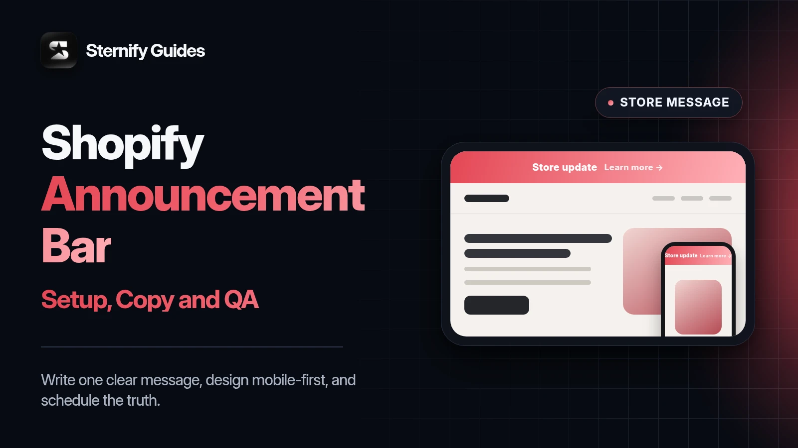
A Shopify announcement bar is the narrow message area above a store’s header. Merchants use it for shipping thresholds, active discount codes, product launches, delivery notices, and seasonal campaigns. Most Shopify themes include a basic announcement bar, so you can often publish a simple message without an app or custom code.
The hard part is not adding the bar. It is deciding what deserves the most visible line on the store, writing copy that survives a mobile screen, and removing the message when it stops being true. This guide covers Shopify’s native setup, practical announcement bar ideas, scheduling, page targeting, countdowns, animation, and accessibility.
Key takeaways
- Use one current message. Multiple rotating offers usually make the most visible line on the store harder to understand.
- A theme bar is enough for a static message. Use an app when you need scheduling, countdowns, targeting, or campaign controls.
- Write the benefit, condition, and action in the shortest complete form, then test it on a narrow mobile screen.
- Use countdowns only for real deadlines and keep the banner, discount, landing page, and campaign dates synchronized.
How to add an announcement bar in Shopify
- Open the theme editor: In Shopify admin, go to Online Store, then Themes, and open the theme editor for the theme you want to change.
- Select the announcement bar: In the section list, open Announcement bar or the equivalent section supplied by your theme. If no section exists, check the theme documentation before editing code.
- Add the message and link: Write the shortest complete version of the offer. Add a destination that matches the message, such as the sale collection, shipping policy, or new product.
- Preview and publish: Check desktop and mobile previews, confirm the link, then save. Visit the live storefront in a private window to verify the published state.
The exact labels differ by theme. Some themes support several announcement blocks, a color scheme, social links, a language selector, or auto-rotation. Others provide one text field and one link. Work with the controls your current theme exposes. Avoid copying code from an old tutorial before confirming the theme lacks the feature you need.
Pick one job for the bar
An announcement bar works best when the visitor can understand and act on one message. If the store needs to explain free shipping, a launch, a discount, and a delivery delay at once, rank them. Operational information that affects an order should usually outrank a decorative campaign.
Reduce purchase uncertainty: Free US shipping over $60.
Promote an active offer: 15% off summer styles with code SUN15.
Route traffic: New linen collection is live. Shop the launch.
Set expectations: Orders placed after Friday ship on Tuesday.
Support a real deadline: Holiday ordering closes December 18 at 2 PM ET.
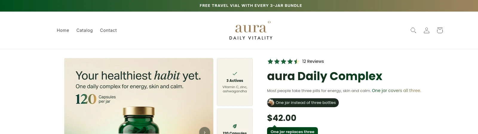
Match the destination to the promise. A sale message should link to eligible products or clear terms, not the homepage. A shipping message can link to the shipping policy when regions, rates, or exclusions need more explanation. If no click adds value, plain text may be better than a vague ‘Learn more.’
Shopify announcement bar ideas with usable copy
Copy patterns by campaign type.
Free shipping: Free shipping available; Free US shipping on orders over $60
Discount: Big sale now; 15% off summer styles with code SUN15
Product launch: Something new is here; The linen collection is live. Shop new arrivals
Gift offer: Free gift; Free travel pouch when you buy any full-size cleanser
Delivery notice: Shipping update; Orders placed after Friday ship Tuesday
Real deadline: Hurry, time is running out; Holiday delivery cutoff: December 18 at 2 PM ET
Replace the examples with your real threshold, eligible products, code, region, timezone, and dates.
Specific copy removes the questions a shopper would otherwise carry into checkout. Name the region for shipping offers. Name the category for discounts. Show the code if a code is required. Include the timezone when a deadline could be read across several regions.
Avoid unexplained superlatives such as ‘best offer ever’ or ‘lowest price’ unless you can substantiate them. Do not claim that only a few products remain unless inventory supports the statement. The bar’s prominent placement makes misleading language more damaging, not less.
Use a simple copy formula
Launch checks
- Benefit: State what the shopper receives, such as free shipping, a discount, a gift, or early access.
- Condition: Name the spend threshold, eligible products, region, code, or customer group.
- Deadline: Include a real end date and timezone when the promotion is time-bound.
- Destination: Link to the collection, product, policy, or terms that complete the message.
You do not need all four parts in every visible line. Mobile width may force the detailed terms onto the linked page. Keep the essential condition in the bar. For example, ‘Free US shipping over $60’ works without a button label because the benefit and condition are complete. ‘Sale ends soon’ leaves the shopper guessing.
Design for mobile before desktop
Open the storefront at common narrow widths and with larger text settings. A sentence that looks short on a laptop can wrap into three lines above a mobile header. That pushes product content down and may collide with menu, market, or account controls.
Lead with the benefit instead of a seasonal greeting.
Keep discount codes easy to select or copy when the bar supports that action.
Avoid an icon, long message, countdown, and button in the same narrow row.
Check long currency, translated copy, and right-to-left languages if your store supports them.
Make the close control large enough to find and use without covering nearby controls.
Separate mobile copy can help when the desktop version includes a date, code, and CTA. Shortening must not change the actual terms. If the mobile version says ‘Free shipping’ while the desktop version says ‘Free US shipping over $60,’ the shorter message creates a different and misleading promise.
Make the bar accessible
Announcement bars sit above every page, so a small accessibility problem repeats across the store. Use readable text, clear focus states, descriptive link text, keyboard-operable controls, and enough color contrast. W3C’s WCAG 2.2 guidance sets a minimum contrast ratio of 4.5:1 for normal text and 3:1 for large text, with defined exceptions.
Motion needs restraint. WCAG 2.2 says that moving, blinking, or scrolling information that starts automatically, lasts more than five seconds, and appears alongside other content needs a mechanism to pause, stop, or hide it unless the movement is essential. A continuously scrolling marquee or rotating message can distract visitors and make the content hard to read.
Provide a pause or stop control for qualifying auto-moving content.
Respect reduced-motion preferences when animation is used.
Do not rely on color alone to communicate that an offer is active or urgent.
Give the close button an accessible name and visible keyboard focus.
Keep the linked destination descriptive in context.
Schedule campaigns instead of relying on a reminder
A stale bar can advertise an expired code or a missed delivery date. For short campaigns, define the start time, end time, and timezone before writing the copy. If the theme does not support scheduling, use a promotion tool that does or assign a documented manual owner for both activation and removal.
- Set the source of truth: Record the offer terms, eligible pages, code, start, end, and timezone in the campaign brief.
- Configure matching dates: Use the same timestamps in the discount, banner, landing page, and any email or paid campaign.
- Preview both states: Verify what visitors see before launch, during the offer, and immediately after the end time.
- Confirm the live switch: Check the storefront after activation and expiration. Keep a fallback message ready for shipping or evergreen value.
Scheduling does not remove the need for a live check. Theme caching, app conflicts, timezone mistakes, and an incorrectly scheduled discount can leave the bar and checkout out of sync. Test the code after the campaign starts, then verify that the bar and discount both stop when promised.
Use countdowns only for real deadlines
A countdown earns its space when knowing the remaining time helps the shopper make a decision. Show the timezone in linked terms when the audience spans regions. Keep the deadline consistent across the banner, discount, landing page, email, and checkout. If the offer continues after the timer ends, customers learn that the store’s deadlines are optional.
Good reasons for a countdown
- A sale or preorder has a fixed, published end time.
- A shipping cutoff affects whether an order can arrive for an event.
- A launch begins at a known time and the timer communicates availability.
- A product drop or event begins at a fixed public time
- The same deadline appears across the store and campaign channels
When to skip a countdown
- The campaign has no real end event.
- The timer restarts by session, device, or page view.
- The countdown crowds out the offer conditions on mobile.
- The timer ends while the discount remains active
- The deadline or timezone is not explained
Target pages based on message relevance
A storewide shipping threshold usually belongs on all shopping pages. A product-specific gift may belong only on eligible product and collection pages. A launch bar can appear on the homepage and related collection. Page targeting reduces the chance that a visitor sees an offer that cannot apply to the product in front of them.
Check the whole path, not one page. A visitor may enter through a product page, open a cart drawer, visit a policy page, and return to checkout. Decide whether the message should persist during that path. Also check whether the bar covers anchor links, sticky headers, cookie controls, or app overlays.
What Sternify Banners adds beyond a basic theme bar
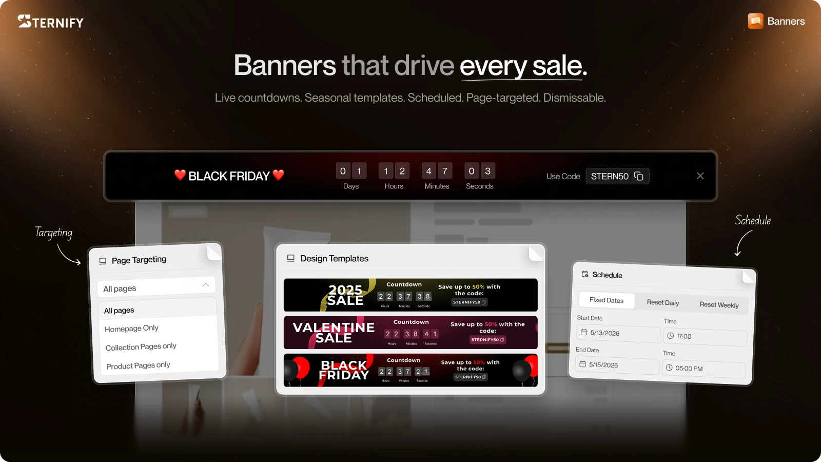
Sternify Banners gives merchants campaign controls that many native theme bars do not include. You can choose seasonal or compact themes, add animated decorative elements, set a large title, include a countdown, and give shoppers either a discount-code action or a redirect CTA. Scheduling can switch the banner on and off and sync the countdown to the campaign window.
Seasonal themes for Christmas, Black Friday, Halloween, and New Year’s Eve, plus a compact option.
Animated decorative elements for seasonal designs.
Title, countdown, discount-code copy, or redirect CTA controls.
Start and end scheduling with countdown timing tied to the schedule.
Page targeting for the homepage, product pages, collection pages, or all pages.
Use those controls to reduce campaign operations, not to manufacture urgency. A compact banner may outperform a decorated seasonal theme when the message is operational or the header is already busy. Choose the smallest format that communicates the offer well.
QA the announcement bar before every launch
Launch checks
- Message accuracy: Confirm benefit, condition, code, region, dates, timezone, exclusions, and linked terms.
- Responsive layout: Test narrow mobile widths, zoom or larger text, translations, long codes, sticky headers, and close controls.
- Interaction and access: Check keyboard focus, link destination, pause controls, reduced motion, and text contrast.
- Campaign state: Verify scheduled start and end, discount availability, page targeting, expired state, and the fallback message.
Take screenshots of the final desktop and mobile states and save the campaign settings. That evidence helps support teams answer questions and gives the next campaign owner a working reference. If the bar links to a collection, check that sold-out or excluded products do not contradict the headline.
Shopify announcement bar FAQs
Does Shopify have a built-in announcement bar?
Many Shopify themes include an announcement bar section in the theme editor. The available controls depend on the theme. Check Online Store, Themes, then the theme editor. Scheduling, countdowns, animation, and page targeting are not universal theme features.
What should I write in a Shopify announcement bar?
State one useful promise and its main condition. Examples include Free US shipping over $60, 15% off summer styles with code SUN15, or Orders placed after Friday ship Tuesday. Link to eligible products or terms when the short line cannot hold the details.
How long should announcement bar text be?
There is no universal character limit because theme width, font, controls, and language vary. Write the shortest complete message, then preview it on a narrow mobile screen and with larger text. Keep the key condition visible.
Can I schedule a Shopify announcement bar?
Only if your theme or an installed app provides scheduling. Shopify's standard theme-editor workflow does not mean every theme has date controls. Sternify Banners supports automatic start and end scheduling and can sync a countdown to that schedule.
Are countdown timers bad for conversions?
A timer can help when it communicates a real sale end, launch, or shipping cutoff. A timer that restarts without a genuine deadline damages trust and may create misleading promotion copy. Keep countdowns readable, accessible, and consistent with the actual campaign end.
Sources and further reading
Shopify Help Center: Add an announcement bar
Shopify Help Center: Customizing themes
W3C WCAG 2.2: Pause, Stop, Hide